Navigation is a crucial component of user experience (UX) design, as it directly impacts how users interact with and navigate through a website or application. Effective navigation ensures that users can easily find the information they need, complete tasks, and explore content effortlessly. In this UX guide, we will explore some best practices for designing intuitive and user-friendly navigation systems.
Keep it Simple and Consistent
Simplicity and consistency are key principles in navigation design. Keep the navigation structure simple, with clear and concise labels that accurately describe the destination. Avoid overwhelming users with too many options, as it can lead to decision paralysis. Consistency is equally important; maintain a consistent navigation style throughout the website or application, ensuring that users can easily recognize and understand how to navigate across different sections.
Follow User Expectations
Users come with preconceived notions of how navigation should work based on their previous experiences. It is crucial to follow established patterns and conventions to meet user expectations. For example, placing the primary navigation at the top or left side of the screen and using familiar icons for common actions like home or search. Deviating too much from established patterns can confuse users and make navigation more challenging.
Clear and Visible Navigation Elements
Make sure navigation elements are easily visible and stand out from the rest of the page content. Use contrasting colors, typography, or visual cues like underlines or icons to draw attention to navigation links. Ensure that navigation labels are legible and provide enough space between elements to prevent accidental clicks or taps. If using drop-down menus or sub-navigation, make them easily accessible and intuitive to use, avoiding excessive nesting or hidden options.
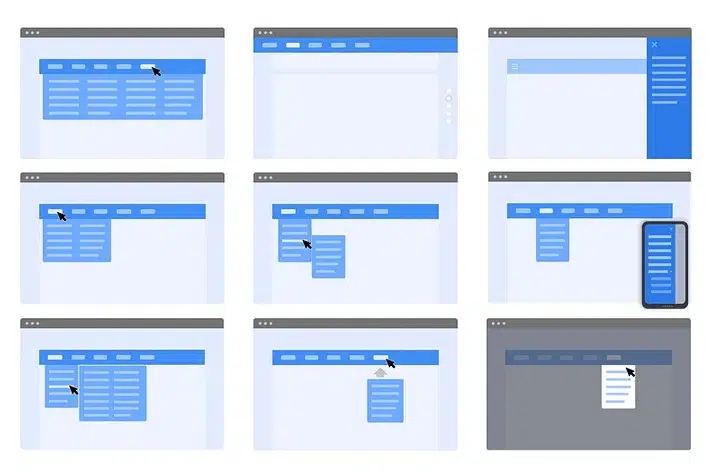
Responsive and Mobile-Friendly Navigation
With the increasing use of mobile devices, designing responsive navigation is crucial. Consider how the navigation will adapt and reorganize on smaller screens. Implement techniques like collapsible menus, off-canvas navigation, or bottom navigation to optimize the user experience on mobile devices. Test the navigation across different devices and screen sizes to ensure it remains usable and intuitive.
Provide Feedback and Visual Cues
Users need feedback when interacting with navigation elements to confirm their actions and understand the system’s response. Use visual cues like highlighting the active page or section to indicate the user’s current location within the website. Provide hover or tap effects on navigation links to communicate interactivity. Additionally, consider using breadcrumb trails, search bars, or contextual navigation to help users understand their position within the overall site structure.
Test and Iterate
User testing is a vital part of navigation design. Conduct usability tests to observe how users interact with your navigation system, identify pain points, and gather feedback for improvement. A/B testing can help compare different navigation approaches to determine which performs better. Iteratively refine your navigation design based on user insights, metrics, and feedback to ensure continuous improvement.
Navigation is an essential aspect of UX design that significantly influences how users navigate and interact with a website or application. By following these best practices, you can create intuitive and user-friendly navigation systems that enhance the overall user experience. Remember to keep it simple, consistent, and responsive, while incorporating visual cues and gathering user feedback to refine and optimize your navigation design.
Do you need a developer to help you integrate a navigation menu into your website? You can contact wpCrafter